Wednesday, 8 January 2014

Raster & Vector Graphics


Vector Graphics


  • an angle based on at least 2 points alluding to points in space that you can then use to create shapes based on the relationship, defined by the angles
  • Points in space relative to each other
  • Adobe illustrator can be used for vector graphics
  • Vector text is not pixelated
  • Vector maintains aspect ratio and will not lose quality 
  • Photogenic pictures such as GTA artwork are real life pictures drawn over with vectors.
  • Vectors are mainly used for printing
  • some websites can be optimised for use of vector graphics
  • Vectors are used for magazines, billboards etc because they can be easily resized and keep their quality. 
  • Vector is rarely used for tiling/textures in games
Vector Image examples:


Raster Graphics

  • AKA Bitmap
  • different kind of rendering style of how an image can be put on a (screen) uses pixels
  • Created images in Photoshop are generally raster graphics
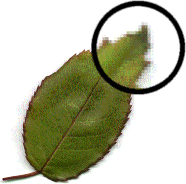
  • Raster images lose their aspect ratio the more it is increased in size.
  • As pixels are not points that can scale, the pixels have to grow as well (this is also known as “stepping) as you do not get new pixels.
  • Raster graphics tend to be used for websites displayed on electronic screens
  • In some rare cases, Raster graphics can be used for print
  • Older cameras used to take pictures as bitmaps (.bmp) but now they are converted to JPEGs
  • Raster text is pixelated
  • Most tiling/texture in games are raster graphics
Bitmap Image examples:

What is an Aspect Ratio?

Aspect ratio is the measurement of image's width times the height (x:y), which is then simplified to it's lowest equivalent. 

16:9 ratio is the aspect ratio for HDTV and widescreen -  720p (1280 x 720) 1080p (1920 x 1080) are the most common true resolutions

Here is a table which consists of other true 16:9 resolutions

Weekly To Do List

Tasks: For next weeks lesson, think about how I can represent myself (interests, personality etc.) and show how to present myself as a logo.

Weekly Progress Blog

17/09/13 - Introduced to the unit, set up this blog

Techniques & Definitions

18/09/13 -
Web page backup technique:  Make a folder on memory stick/college system, name it after the unit relating to the web page, minimise the folder on desktop, go back to browser of choice, click and hold icon, drag and drop into the new folder. To use webpage offline, save as web archive.


08/10/13 - 

Hue - colour spectrum

R - Red

G - Green
B - Blue

Ink Colours for printing

Cyan - C
Magenta - M
Yellow - Y
Black - K

# - hexidecimal 


Photoshop Tips
History - pressing CTRL/ALT/Z will act as CTRL/Z, but just hide the action performed
Flooding canvas with one colour - ALT/BACKSPACE

shift/alt whilst using the marquee tool will expand the shape from the crosshair point


Versions being used - Photoshop CS5.1 64 bit (College) / 

Tuesday, 17 September 2013

Autumn Term - Logo Research

Berzerk Studio
Uses both artwork and styled text. Artwork is of a barbarian style helmet. "Berzerk" enlarges the Z to split Ber and erk, along with the word studio written on the Z itself. White and black colours are occasionally inverted in variations of the logo. The focus points are as follows - helmet, "Berzerk" and finally "Studio". All upper case.

Blizzard Entertainment
 "Blizzard" uses styled text and has an icy blue colour and has jagged edges to give the effect of ice. In addition, "IZ" is placed on top of an enlarged L, the left side of "A" is on top of the second larger "Z" and overall most of the logo appears to have formed via cracks in the ice."Entertainment" uses a plain font design, which helps "Blizzard" to pop out. All upper case.

Dice (EA Digital Illusions CE)
Styled text which is composed of straight lines. The left part of D is missing and therefore looks like a reversed C - this was done not only for aesthetic reasons but to avoid confusion between the letters D and O. Whilst there would have been confusion if the left part of E was left in the logo, it was most likely done just for aesthetic purposes. All upper case.

Naughty Dog


Uses a standard bold font - black for "Naughty" and white for "Dog", with contrasting colour backgrounds. Core focus of this logo is the signature paw, with 2 of the claws slightly overlapping the "Y". This simple yet effective addition to the logo lets the consumer think of the red paw when talking about Naughty Dog. All upper case.

Ndemic Creations
 Simple font - "Ndemic" in red, "Creations" is a smaller size in black. Logo seems to be based on their sole game Plague Inc. and has the appearance of a plague-like cloud with a 3d effect. All upper case.

Quantic Dream


Uses a very basic font. The only noticeable aspect of this logo is that the "c" overlaps the "d" slightly. The colour of "quantic" is grey whilst "dream" is cream. All lower case.

The Behemoth

 The picture appears to be a "behemoth" chicken, which ties in with the title of this game development company. Interestingly, they have "the" in lower case but "BEHEMOTH" in upper case - this again links with the picture of the chicken being large and dwarfs "the" in comparison.